
Pandas in Action: Unveiling Malaysia's Vehicle Landscape Through Visualization
Issue 30: Transforming Data into Insights with Charts and Graphs


Welcome back, Pandas adventurers!
In our previous newsletter, we embarked on our journey to explore Malaysia's vehicle registration data, getting acquainted with the dataset and tidying it up. Now, it's time to bring our data to life with the power of visualization!
The Power of Visualization
Visualizations are not just pretty pictures. They are powerful tools for:
Uncovering patterns and trends: Spotting insights that might be hidden in raw data.
Communicating findings effectively: Sharing your discoveries with others in a clear and compelling way.
Making informed decisions: Guiding data-driven decision-making.
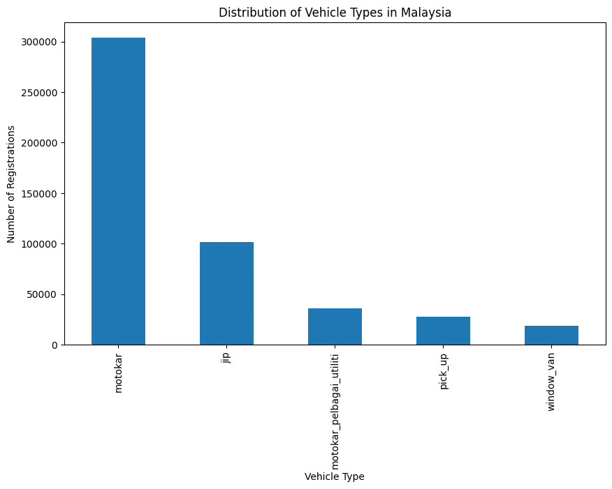
Visualizing Vehicle Types
Let's start by understanding the distribution of vehicle types in Malaysia:
import matplotlib.pyplot as plt

# Count the occurrences of each vehicle type
type_counts = df['type'].value_counts()

# Create a bar chart
plt.figure(figsize=(10, 6))
type_counts.plot(kind='bar')
plt.title('Distribution of Vehicle Types in Malaysia')
plt.xlabel('Vehicle Type')
plt.ylabel('Number of Registrations')
plt.show()
Output:
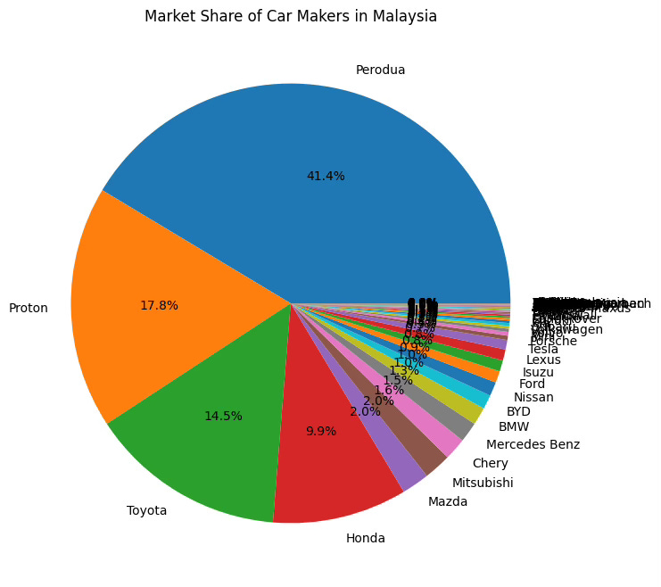
Exploring Car Makers
Next, let's visualize the market share of different car makers:
# Count the occurrences of each car maker
maker_counts = df['maker'].value_counts()

# Create a pie chart
plt.figure(figsize=(8, 8))
maker_counts.plot(kind='pie', autopct='%1.1f%%')
plt.title('Market Share of Car Makers in Malaysia')
plt.ylabel('')  # Remove the default y-label
plt.show()
Output:
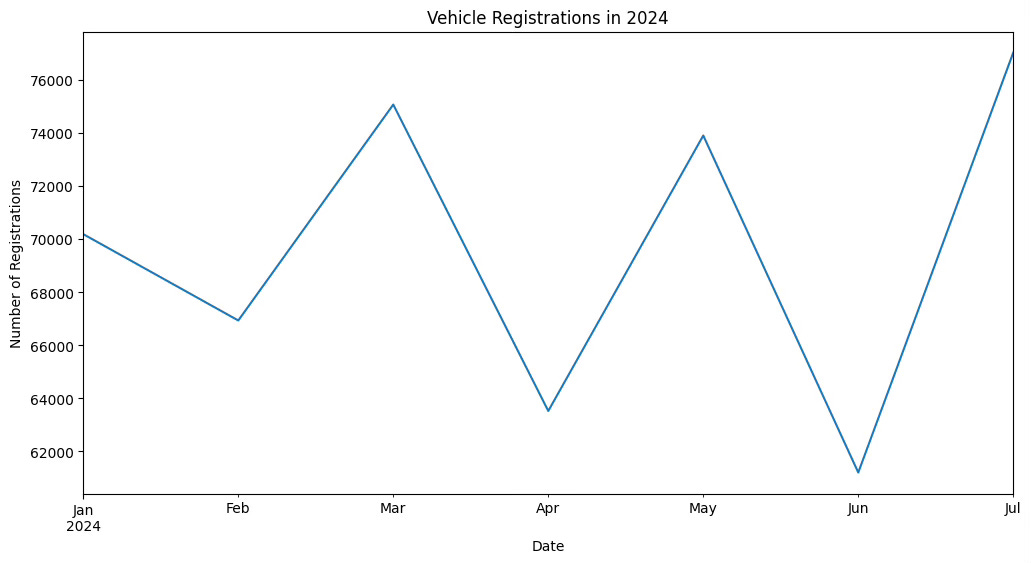
Analyzing Trends Over Time
If your dataset includes the date_reg column, you can visualize how vehicle registrations have changed over time. Let's assume you've already converted date_reg to datetime format in the previous newsletter:
# Convert 'date_reg' to datetime (if not already done)
df['date_reg'] = pd.to_datetime(df['date_reg'], format='%Y-%m-%d')

# Filter data for 2024
df_2024 = df[df['date_reg'].dt.year == 2024]

# Set 'date_reg' as the index for the filtered DataFrame
df_2024.set_index('date_reg', inplace=True)

# Resample and plot (directly on the index)
monthly_registrations_2024 = df_2024.resample('M').size()

plt.figure(figsize=(12, 6))
monthly_registrations_2024.plot()
plt.title('Vehicle Registrations in 2024')
plt.xlabel('Date')
plt.ylabel('Number of Registrations')
plt.show()
Output:
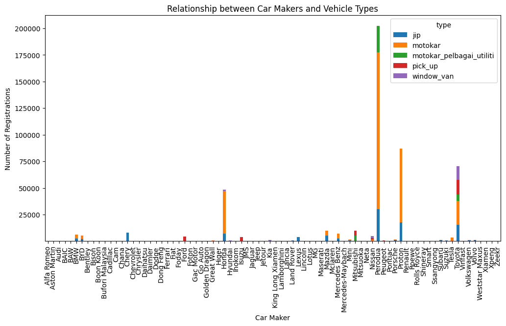
Unveiling Relationships
Let's explore the relationship between car makers and the types of vehicles they produce:
# Create a cross-tabulation of 'maker' and 'type'
maker_type_crosstab = pd.crosstab(df['maker'], df['type'])

# Create a stacked bar chart
maker_type_crosstab.plot(kind='bar', stacked=True, figsize=(12, 6))
plt.title('Relationship between Car Makers and Vehicle Types')
plt.xlabel('Car Maker')
plt.ylabel('Number of Registrations')
plt.show()
Output:
Your Turn to Explore
Now it's your time to shine! Experiment with different visualization techniques to uncover more insights from the Malaysian vehicle registration data. Try visualizing the distribution of car colors, fuel types, or the relationship between registration state and vehicle type.